The development of software with a good user interface can be quite tricky. Software developers and designers need to translate the advantages and the functioning of the software as simple as possible. Translation in the sense that for the users it needs to be clear what they can do with the software solution. That is why a good user interface needs to be pleasing both visually and functionally. At Invantive we are constantly working to improve our software packages on both the visual and functional aspect. Improvements that have been proposed by Invantive itself or by you as user. With this contribution we give you a glimpse behind the scenes in the development of the online hour registration interface for Invantive Estate 2012 R2.
Registering hours online with more ease using Invantive Estate
Software development is a continuous process. Software is, after all, never finished. The market is continually subjected to change, the users need to meet new demands or request for new possibilities. That is why software development is also anticipating. At Invantive software is developed in steps for that exact reason. Each year we have two software releases in which improvements are made. For Invantive Estate 2012 Release 2 the online hour registration interface has been adjusted, amongst other things. This adjustment will ensure that requesting and registering hours online is easier and clearer. But what have been the changes to the hour registration screen exactly and why is that better?
Old online hour registration screen
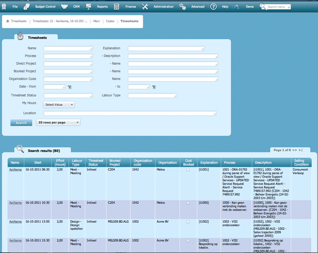
In the image below you can see the familiar online hour registration interface of Invantive Estate. At a first glance there seems to be no issue with this online hour registration screen. It offers an overview of the worked hours, work type, projects and processes.
The layout and display of the functions is not optimal however. For one, the use of the space available is not optimally used. That is, there are three loose fields that have been placed vertically. This layout causes unnecessary scrolling and empty spaces on the screen. Besides, this layout does not come across well for the online registration of hours on a mobile device. Secondly, the color composition of the input fields and the field as a whole is not distinctive enough. That is because it is white on white which means that the contrast of these fields is not clear to everyone. With the new release there have been the needed adjustments to the online hour registration screen.
New online hour registration interface
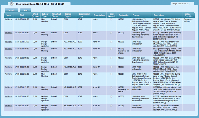
For the newest online hour registration interface for Invantive Estate user friendliness and design are central. The online entering, viewing and requesting of registered hours has been simplified for both desktop and mobile users. First of all, the layout has been adjusted. In the images below you can see the new hour registration screen.
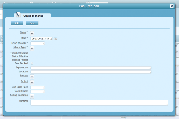
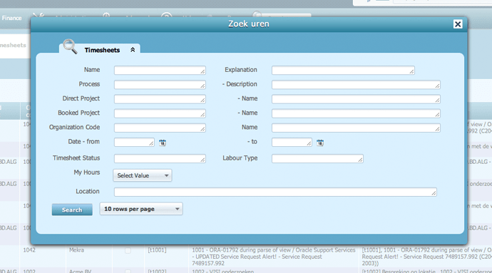
As you can see there is now just óne field displayed on the screen. Within this field you can see the work hours, projects, processes and employee. The requesting or entering of hours can be done with the added buttons. After the click a separate screen appears for the requesting and registration of the hours. Compared to the old situation this adjustment offers several advantages:
First of all it is now clearer for the users which field they have in front of them. The online requesting and registering of hours now happens separately. This creates a clear functional divide that has a positive effect on the use. Scrolling is no longer needed.
Secondly the color composition is adjusted. White has made room for blue which makes for a clearer distinction between the fields. In addition the new composition looks calmer.
This and other adjustments can be seen in the new release of Invantive Estate. This new software release will be offered in the beginning of December 2012.
Invantive Estate release 2012 R2
With the applied adjustments to Invantive Estate Invantive desires to improve user comfort and make the software more visually pleasing. The adjustment of the hour registration interface is óne of the 200 adjustments for release 2012 R2 of Invantive Estate. What new adjustments and features are coming up will be here to read for you in a subsequent blog.
What do you think of these adjustments? Do you recognise its advantages or would you like to see it in a different way? Let us know!


